Tidy Tuesday: 2025-01-04, Simpsons Episodes Dataset EDA
TidyTuesday’s 2025 Simpsons Dataset comes in 4 sections:
- simpsons_characters.csv
- simpsons_episodes.csv
- simpsons_locations.csv
- simpsons_script_lines.csv
I recently constructed a graph on section #2, simpsons_episodes.csv. In this article, I will show you the process I used to explore that set of data.
First, I took a peek at the data dictionary (Data Science Learning Community, 2025):
| variable | class | description |
|---|---|---|
| id | double | Unique identifier for each episode record. |
| image_url | character | URL linking to the image associated with the episode record. |
| imdb_rating | double | IMDb rating for the episode. |
| imdb_votes | double | Number of votes received on IMDb for the episode. |
| number_in_season | double | Episode number within the season. |
| number_in_series | double | Episode number within the series. |
| original_air_date | date | Date the episode originally aired. |
| original_air_year | double | Year the episode originally aired. |
| production_code | character | Code used in production to identify the episode. |
| season | double | Season number of the episode. |
| title | character | Title of the episode. |
| us_viewers_in_millions | double | Number of viewers in the U.S. in millions. |
| video_url | character | URL linking to the video associated with the record. |
| views | double | Total number of views recorded for the episode video URL. |
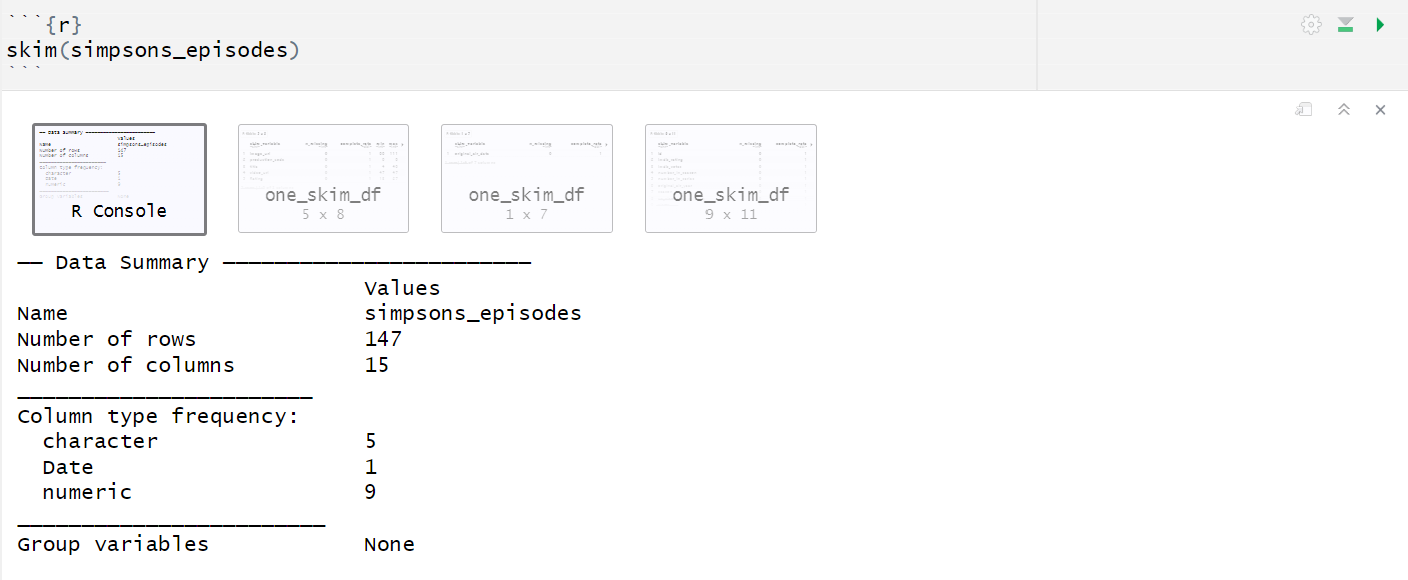
Next, I use R-language functions to examine my data a little closer. My favorites are dplyr’s glimpse() and the Skimr R package.
I then came up with a few research questions to help guide my exploration. Here are the ones I got for my previous visualization:
- How does the distribution of imdb_rating vary with the other variables of the dataset?
- What are the most relevant groupings for episode data?
I chose to focus on the imdb_rating columns because it seemed to have a well-spread distribution. Columns us_viewers_in_millions, views, and imdb_votes had also piqued my interest for similar reasons, but I decided to reserve those variables for a future visualization. A simple graphic on imdb_rating felt like a great way to begin my analysis.
The season variable felt like a natural grouping choice. In comparing an ordinal variable like season to a quantiative variable like imdb_rating, furthered my analysis by checking out a few styles of graphs.
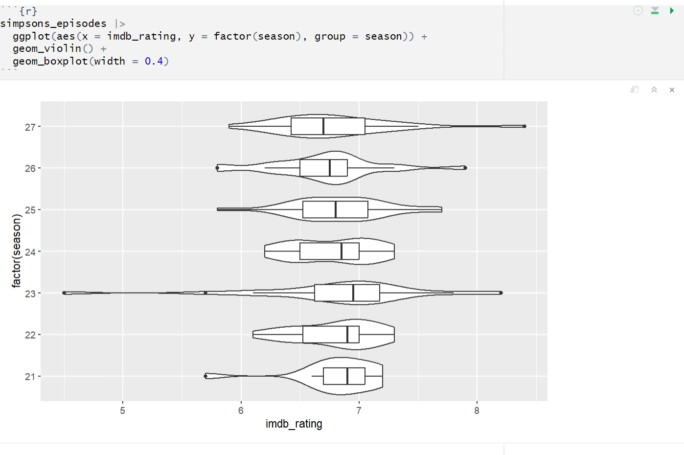
Here’s a prototype I made for a violin plot. I think its main strength is that it contained a lot of information about the conditional distributions of imdb_rating given each season. The graph, however, felt very noisy to me. This led me to the stacked barchart strategy I posted the other day:
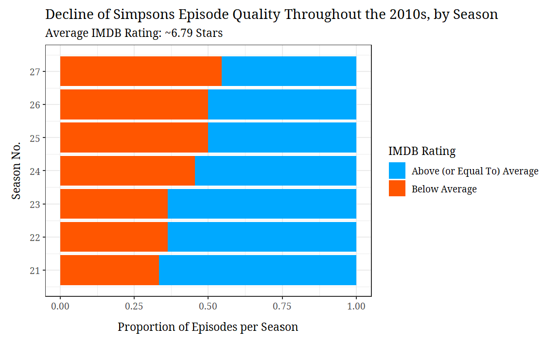
It’s not perfect, but my graph has its strengths. It does a pretty good job of showing the general imdb_rating differences between each season. I’m also proud of how clean it looks.
A lot of information is lost about the conditional distributions of each season, however. I do not know anything about outliers. I do not know anything about the ranges. No modality info either.
And immediately after I posted my previous graph, I remembered the existence of the ridgeline plot:
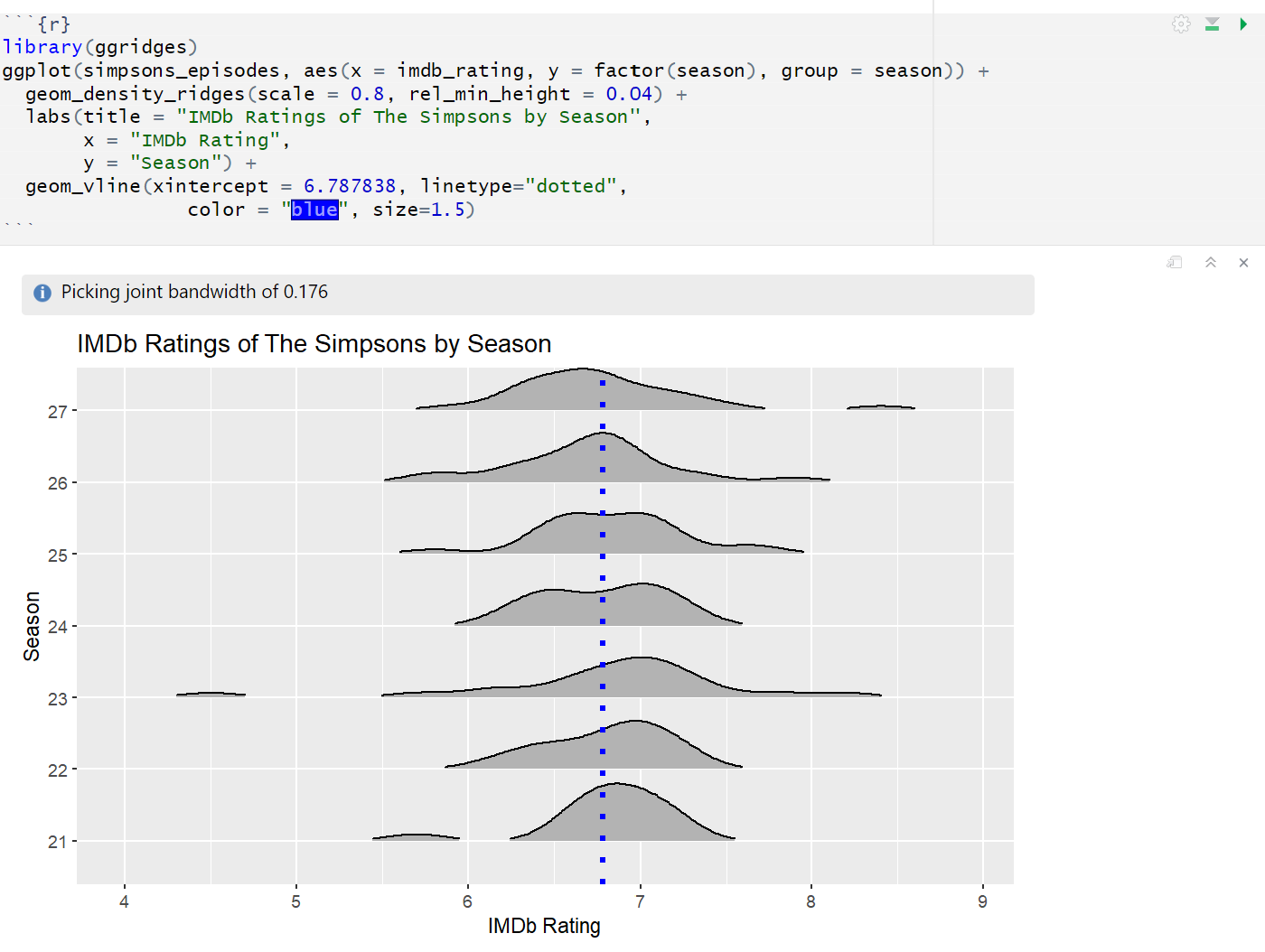
This graph gives way more information about the distributions. I’m going to post a polished version of this in the upcoming few days.
As another future direction, I’d like to look deeper into the number_in_series and number_in_season columns. They seem like pretty relevant info for a more complex visualization.
References
- Data Science Learning Community (2025). Tidy Tuesday: A weekly social data project. https://tidytues.day.