Tidy Tuesday: 2025-01-04, Simpsons Graphs Pt. 1
Another entry for TidyTuesday.
I’m a little late to the party this time. School has been rough.
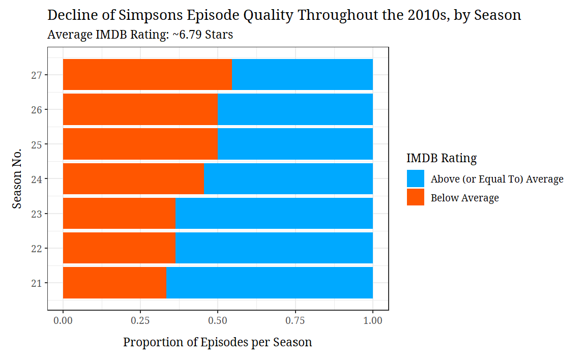
As you can see, as time passed by, The Simpsons got worse and worse throughout the 2010s (according to IMDB data).
You’ll see a lot more Simpsons content from this point forward.
Here’s the code I used to produce the graph:
1
2
3
4
5
6
7
8
9
10
11
12
13
14
15
16
17
18
19
20
21
22
23
24
25
26
27
28
29
30
31
32
33
34
35
36
37
38
39
40
41
42
43
44
#import libraries
library(tidyverse)
library(tidytuesdayR)
library(extrafont)

#input fonts
#font_import()
#loadfonts(device = "win")

#import data
tuesdata <- tidytuesdayR::tt_load(2025, week = 5)
simpsons_episodes <- tuesdata$simpsons_episodes


#Calculate the mean (= 6.787838)
#mean(simpsons_episodes$imdb_rating, na.rm = TRUE)

#filter data
simpsons_episodes <- simpsons_episodes |>
  mutate(
    Rating = ifelse(imdb_rating > 6.787838, "Above (or Equal To) Average", "Below Average"),
  ) |>
  na.omit() |>
  filter(season < 28)

#generate visualization
simpsons_episodes |>
  ggplot(aes(x = season, fill = Rating)) +
  geom_bar(position = "fill") +
  coord_flip() +
  labs(y = "Proportion of Episodes per Season",
       title = "Decline of Simpsons Episode Quality Throughout the 2010s, by Season",
       x = "Season No.",
       fill = "IMDB Rating",
       subtitle = "Average IMDB Rating: ~6.79 Stars"
       ) +
  scale_x_continuous(breaks=seq(20,27,1)) +
  scale_fill_manual(values=c("#00A9FF",
                             "#FF5600")) +
  theme_bw() +
  theme(text=element_text(family="Noto Serif"),
        axis.title.x = element_text(margin = margin(t = 10)),
        axis.title.y = element_text(margin = margin(r = 7))
  )
References
- Data Science Learning Community (2024). Tidy Tuesday: A weekly social data project. https://tidytues.day.
This post is licensed under CC BY 4.0 by the author.