Tidy Tuesday: 2025-01-21
To practice my data analysis skills, I plan to participate in TidyTuesday from this point going forward.
For my first week, I made a simple visualization comparing the success rates of Spring vs. Autumn Himalayas expeditions:
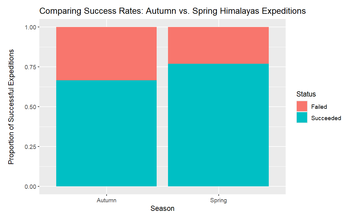
By the chart above, Spring expeditions in the Himalayas observe a slightly greater success rate than those in Autumn. As a data scientist, however, I require more than a single visualization to make claims about a dataset. This led me to formulate two hypotheses for evaluation:
Null Hypothesis: There exists no significant association between season and expedition success rate. In other words, season of the year and success rate is independent.
Alternative Hypothesis: There exists a significant difference between the success rate of Autumn expeditions and the success rate of Spring expeditions. In other words, season of the year and success rate are dependent.
We can test these hypotheses via a chi-squared test:
1
2
3
4
Pearson's Chi-squared test with Yates' continuity correction

data:  season_exped_tab
X-squared = 10.794, df = 1, p-value = 0.001018
With p < 0.05, we have sufficient evidence to reject the null hypothesis. This means we observe a significant difference between the proportion of successes vs. failures between Spring and Autumn expeditions. Long story short, Spring expeditions are more successful than those in Autumn.
I generated these results with the following R code:
1
2
3
4
5
6
7
8
9
10
11
12
13
14
15
16
17
18
19
20
21
## install.packages("tidytuesdayR")
library(tidyverse)

tuesdata <- tidytuesdayR::tt_load(2025, week = 3)
exped_tidy <- tuesdata$exped_tidy

exped_tidy.springandautumn <-dplyr::filter(exped_tidy, SEASON_FACTOR  == "Spring" | SEASON_FACTOR == "Autumn")

exped_tidy.springandautumn <- exped_tidy.springandautumn |>
  mutate(Status = ifelse(TERMREASON == 1, "Succeeded", "Failed"))

exped_tidy.springandautumn |>
  ggplot(aes(x = SEASON_FACTOR, fill = Status)) +
  geom_bar(position = "fill") +
  labs(title="Comparing Success Rates: Autumn vs. Spring Himalayas Expeditions",
       x = "Season",
       y = "Proportion of Successful Expeditions") +
   theme(axis.title.y = element_text(margin = margin(t = 0, r = 15, b = 0, l = 0)))

season_exped_tab <- table(exped_tidy.springandautumn$SEASON_FACTOR, exped_tidy.springandautumn$Status)
chisq.test(season_exped_tab)
For future visualizations, I plan to make more complex data stories. However, this was my first week of classes for the Spring semester.
References
- Data Science Learning Community (2024). Tidy Tuesday: A weekly social data project. https://tidytues.day.